I have a huge pile of online courses bookmarked that I would like to run through. This does have some pitfalls, maybe I’ll get to that another day. Today I want to discuss one I finished. The FreeCodeCamp Responsive Web Design course. You get a little certification for completing these, which mostly just bolsters the part of me that, doesn’t really find much value in certifications. I didn’t really need to take this course, but it’s part of the basic “core list” on FreeCodeCamp’s website, and my obsessive completionism mind says I should do those, in addition to anything else I might find on the site. I am not a web design expert (maybe, something something Imposter Syndrome), I don’t really need to take this course. Of all of the coding I have done, web design is what I’ve done the most. I figure this would be a breeze.
Boy was it not.
And not because it was hard.
I have been doing some other courses on this website, and there is a lot of variety in teaching styles, so this is less a criticism of FCC and more a criticism of this course. I also will add that if you were a complete beginner, it probably would be, less tedious. It touches a bit on the “maybe I’ll get to that another day” back at the top of this post, in that soooo much online learning is sooooo beginner oriented it’s a bit of a trap.
But anyway, the Responsive Web Design course. I’ll run through some of the stuff built in a bit, but I want to address some issues I had with the course, not even the content, just the structure. It’s probably just a limitation of the automated system more than anything else.
It’s incredibly hand holdey.
To the point of being a bit tedious, and possibly to some extent being bad for actually learning. One of the praises I have had for that Angela Yu Python course was how well it ramped up its projects. It presented an idea, it hand held you through a project, it guided you through a second project using that concept, then it would tell you to free-form a related project. Repeat, for each new concept. Where I felt that this FCC course missed is the part where eventually it lets you do more on your own. One easy example, early on, it covers the basic structure of an HTML page and things to put in the header, like the link to the style sheet or metadata. And then, every lesson after, it just, keeps repeating the same 3 or 4 steps to add these items.
Ideally, at some point, it would just be a step to “Add the standard boilerplate HTML and header”. With no prompts on what goes in there, so that you have to do it entirely on your own.
This sort of thing shows up a lot in later lessons too. It will do things you have done several times before, in this clunky step-by-step fashion. “Add a width of XXX to this class”, “Now set the background color to #XXXXXX”, now set the positioning. At some point, it really feels like it would be beneficial to just say, “Set up this div block with these parameters, so you are forced to do it on your own completely. instead of one step at a time, explicitly spelled out each time.
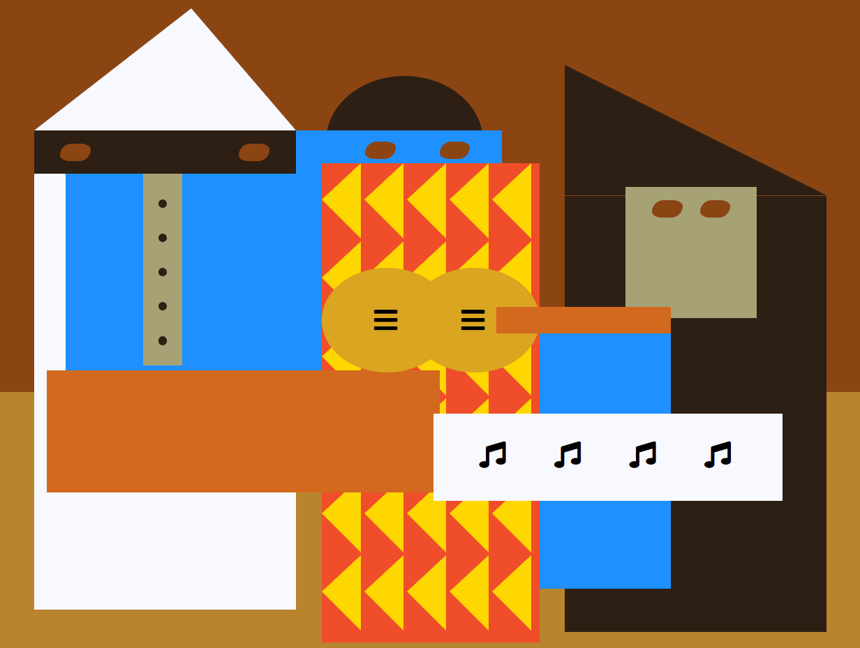
You can skip anything that isn’t part of the actual 5 main tests. Which is totally doable, because another issue I found was that the previous teaching, rarely had anything to do with the “free-form test” part. For the first one you build a survey form, and that one matched pretty well. The Tribute Page was close-ish, but starting to stray. The following two sections end with a Product Landing Page and a Technical Documentation Page. Which are basically just, slight variations of the Tribute Page. As is the final project of a Personal Portfolio page. The exercises though are these slightly painfully slow little CSS-based art projects. You kind of learn some neat techniques, but honestly, as someone who has done some front-end dev work, a lot of it is simply not practical. The CSS penguin is neat, but if I want a penguin on my webpage, I’m just going to find a PNG.
The final challenges themselves are kind of simple to cheese through as well. There is a checklist of what it’s looking for, if you meet those requirements, you pass. It doesn’t matter if the end result is even functional. For the Profile page, I took the code from my existing Github.io page and added some ID tags to it.
There is also this weird inconsistency of methodology. It’s most obvious in colors. There are several ways to assign colors in CSS. Which one is used in this course is inconsistent, though it seems to prefer RGB (R G B). Personally, I prefer just using hex, it’s simple and easy Just an easy #aaaaaa, that sort of thing. There is a lot in this course that actually kind of feels like there is an instructor trying to push some supremely anal-retentive and less-used CSS concepts on the world. using rgb instead of hex doesn’t make you a graphic designer even though it feels fancier. Also, classes are much preferred to ids. There are a lot of places using ids in this course where it should use classes.
Anyway, the projects themselves. I’ve posted the whole thing on GitHub, and I’ll point out my personal highlights.
- CSS Colored markers – As tedious as the course was in its teaching methods, the little artsy CSS things do turn out neat like these little markers. This was probably the most interesting from the first section.
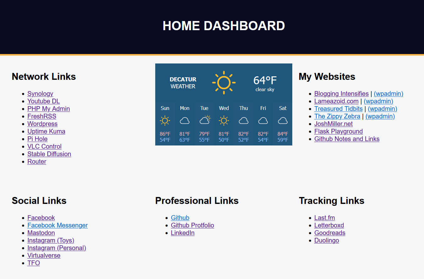
- Flexbox Photo Gallery – I actually reused this code to build a new version of my home dashboard to replace the one I lost when my Raspberry Pi crapped out. This is probably the most valuable lesson in this whole lesson set.
- CHVRCHES Tribute Page – Not that exciting of a design, but the final project was to build a tribute page, so I made one for CHVRCHES.
- Balance Sheet – It’s nice looking, but there are jQuery libraries that basically just do this, with tables.
- Picasso Painting – I have no idea WTF this is supposed to be. Apparently, others don’t either because I noticed that at some point this lesson was replaced with one where you build a cat painting.
- Piano – I actually want to see about combining this with part of what was learned in the FCC JavaScript class to make the Piano functional at some point.
- Magazine Layout – It’s kind of a neat layout, I may reuse some of this code at some point, but I don’t know what I would use it for.
- Penguin – Look at him wave, isn’t he adorable?
Josh Miller aka “Ramen Junkie”. I write about my various hobbies here. Mostly coding, photography, and music. Sometimes I just write about life in general. I also post sometimes about toy collecting and video games at Lameazoid.com.